Bootstrap Table Example
Introduction
Tables are present in most apps (web, desktop or mobile app) and they are a main component in providing information to the final user. The HTML tables are actually used to present data in framework way like columns and rows . With working with Bootstrap 4 framework you are able to easily enhance the look of the table.
In the present day, with the significance that the user interface has, understanding precisely how to enhance the appearance of a Bootstrap table becomes as relevant as it is. In this case, one of the systems that have become reference is Bootstrap. This front-end framework, among lots of other features , provides a variety of functions for designing and enhancing the display of different elements, such as tables.
Standard table in Bootstrap
To mode a table with Bootstrap, simply provide the table class to the
<table>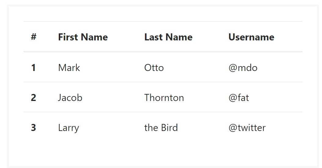
<table class="table">
  <thead>
    <tr>
      <th>#</th>
      <th>First Name</th>
      <th>Last Name</th>
      <th>Username</th>
    </tr>
  </thead>
  <tbody>
    <tr>
      <th scope="row">1</th>
      <td>Mark</td>
      <td>Otto</td>
      <td>@mdo</td>
    </tr>
    <tr>
      <th scope="row">2</th>
      <td>Jacob</td>
      <td>Thornton</td>
      <td>@fat</td>
    </tr>
    <tr>
      <th scope="row">3</th>
      <td>Larry</td>
      <td>the Bird</td>
      <td>@twitter</td>
    </tr>
  </tbody>
</table>
Inverse tables.
Some of the latest tables in Bootsrap 4 is the inverse tables. Class
.table-inverse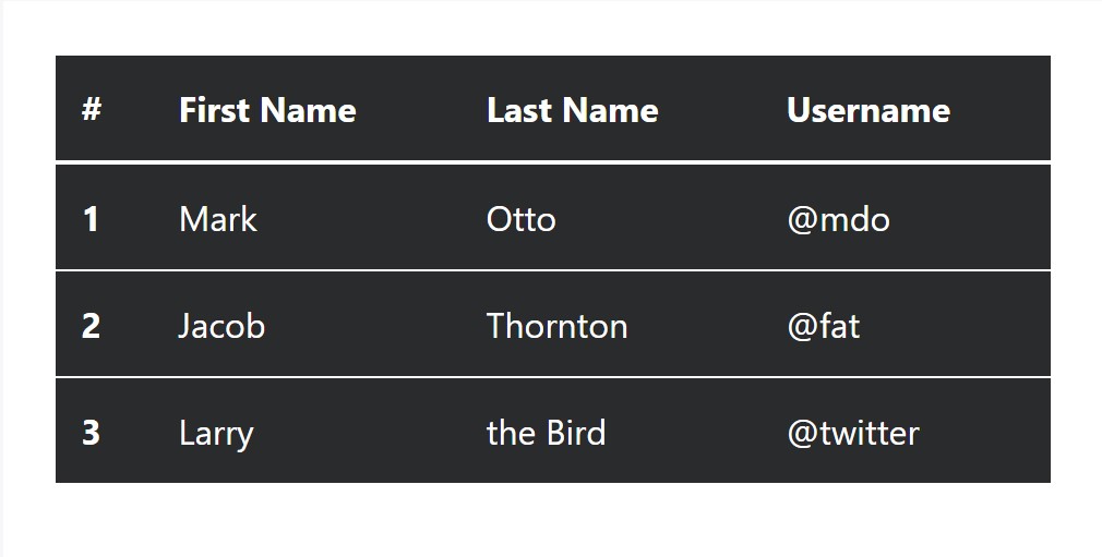
<table class="table table-inverse">
  <thead>
    <tr>
      <th>#</th>
      <th>First Name</th>
      <th>Last Name</th>
      <th>Username</th>
    </tr>
  </thead>
  <tbody>
    <tr>
      <th scope="row">1</th>
      <td>Mark</td>
      <td>Otto</td>
      <td>@mdo</td>
    </tr>
    <tr>
      <th scope="row">2</th>
      <td>Jacob</td>
      <td>Thornton</td>
      <td>@fat</td>
    </tr>
    <tr>
      <th scope="row">3</th>
      <td>Larry</td>
      <td>the Bird</td>
      <td>@twitter</td>
    </tr>
  </tbody>
</table>
Additional classes
For tables there are also some classes that help you to apply a variety of styles to a table ( learn more here), they are:
●
table-striped●
table-bordered●
table-hover●
table-condensedTo add such looks, just simply add in the wanted classes to the: <table>: <table class="table table-striped table-bordered table-condensed table-hover">
Table head options
Much like default and inverse tables, put into action one of two modifier classes to get
<thead>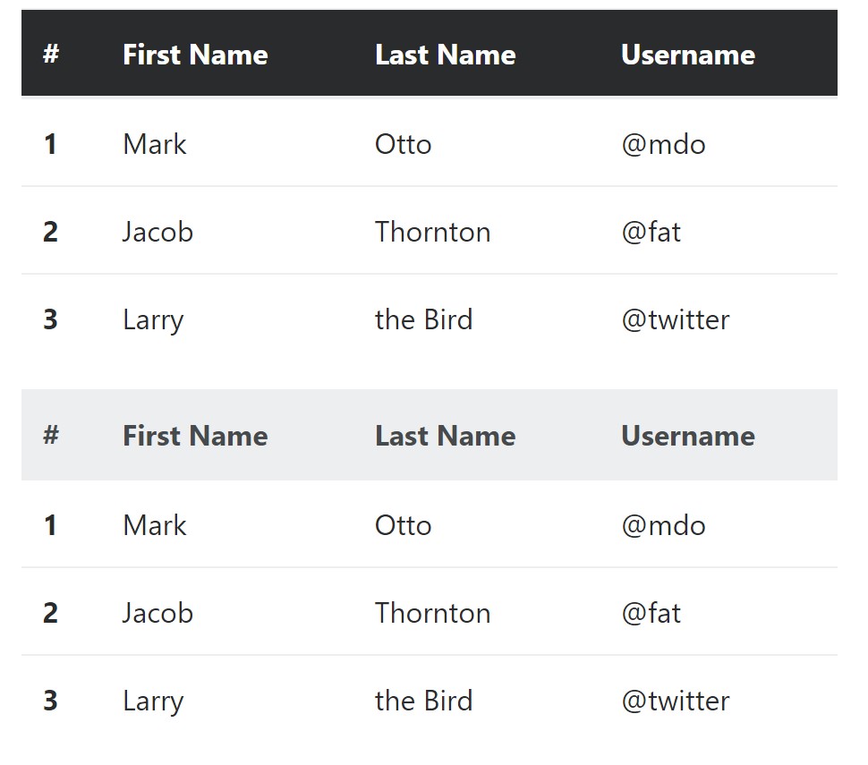
<table class="table">
  <thead class="thead-inverse">
    <tr>
      <th>#</th>
      <th>First Name</th>
      <th>Last Name</th>
      <th>Username</th>
    </tr>
  </thead>
  <tbody>
    <tr>
      <th scope="row">1</th>
      <td>Mark</td>
      <td>Otto</td>
      <td>@mdo</td>
    </tr>
    <tr>
      <th scope="row">2</th>
      <td>Jacob</td>
      <td>Thornton</td>
      <td>@fat</td>
    </tr>
    <tr>
      <th scope="row">3</th>
      <td>Larry</td>
      <td>the Bird</td>
      <td>@twitter</td>
    </tr>
  </tbody>
</table>

<table class="table">
  <thead class="thead-default">
    <tr>
      <th>#</th>
      <th>First Name</th>
      <th>Last Name</th>
      <th>Username</th>
    </tr>
  </thead>
  <tbody>
    <tr>
      <th scope="row">1</th>
      <td>Mark</td>
      <td>Otto</td>
      <td>@mdo</td>
    </tr>
    <tr>
      <th scope="row">2</th>
      <td>Jacob</td>
      <td>Thornton</td>
      <td>@fat</td>
    </tr>
    <tr>
      <th scope="row">3</th>
      <td>Larry</td>
      <td>the Bird</td>
      <td>@twitter</td>
    </tr>
  </tbody>
</table>
Striped rows
Zebra-like stripes may be brought in with the
.table-striped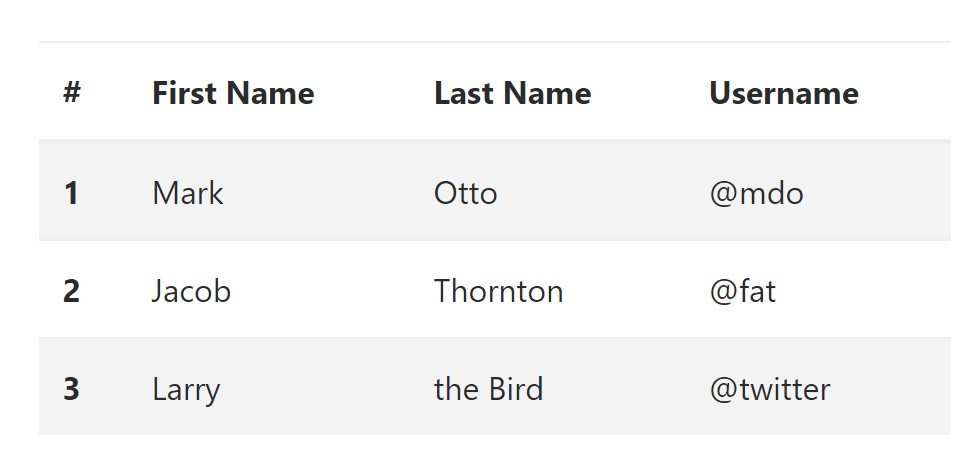
<table class="table table-striped">
  <thead>
    <tr>
      <th>#</th>
      <th>First Name</th>
      <th>Last Name</th>
      <th>Username</th>
    </tr>
  </thead>
  <tbody>
    <tr>
      <th scope="row">1</th>
      <td>Mark</td>
      <td>Otto</td>
      <td>@mdo</td>
    </tr>
    <tr>
      <th scope="row">2</th>
      <td>Jacob</td>
      <td>Thornton</td>
      <td>@fat</td>
    </tr>
    <tr>
      <th scope="row">3</th>
      <td>Larry</td>
      <td>the Bird</td>
      <td>@twitter</td>
    </tr>
  </tbody>
</table>
Hover Rows
To make a hover side effect in the rows of your table add in the
.table-hover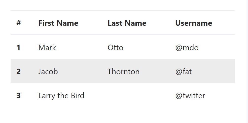
<table class="table table-hover">
  <thead>
    <tr>
      <th>#</th>
      <th>First Name</th>
      <th>Last Name</th>
      <th>Username</th>
    </tr>
  </thead>
  <tbody>
    <tr>
      <th scope="row">1</th>
      <td>Mark</td>
      <td>Otto</td>
      <td>@mdo</td>
    </tr>
    <tr>
      <th scope="row">2</th>
      <td>Jacob</td>
      <td>Thornton</td>
      <td>@fat</td>
    </tr>
    <tr>
      <th scope="row">3</th>
      <td colspan="2">Larry the Bird</td>
      <td>@twitter</td>
    </tr>
  </tbody>
</table>
Bordered Table
You can certainly incorporate the borders on any table slide and a cell by the
.table-bordered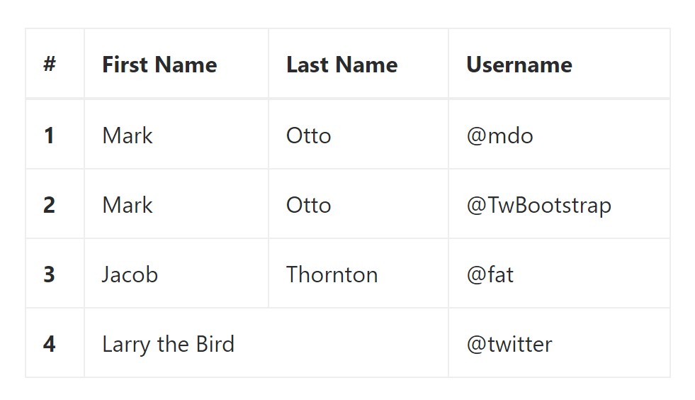
<table class="table table-bordered">
  <thead>
    <tr>
      <th>#</th>
      <th>First Name</th>
      <th>Last Name</th>
      <th>Username</th>
    </tr>
  </thead>
  <tbody>
    <tr>
      <th scope="row">1</th>
      <td>Mark</td>
      <td>Otto</td>
      <td>@mdo</td>
    </tr>
    <tr>
      <th scope="row">2</th>
      <td>Mark</td>
      <td>Otto</td>
      <td>@TwBootstrap</td>
    </tr>
    <tr>
      <th scope="row">3</th>
      <td>Jacob</td>
      <td>Thornton</td>
      <td>@fat</td>
    </tr>
    <tr>
      <th scope="row">4</th>
      <td colspan="2">Larry the Bird</td>
      <td>@twitter</td>
    </tr>
  </tbody>
</table>
Compressed Table
On the occasion that you intend to make your table a lot more compact - then you are able to cut cell padding in half by having this class:
.table-condensedBear in mind that, while Bootstrap 4 uses
.table-sm.table-condensed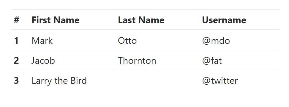
<table class="table table-sm">
  <thead>
    <tr>
      <th>#</th>
      <th>First Name</th>
      <th>Last Name</th>
      <th>Username</th>
    </tr>
  </thead>
  <tbody>
    <tr>
      <th scope="row">1</th>
      <td>Mark</td>
      <td>Otto</td>
      <td>@mdo</td>
    </tr>
    <tr>
      <th scope="row">2</th>
      <td>Jacob</td>
      <td>Thornton</td>
      <td>@fat</td>
    </tr>
    <tr>
      <th scope="row">3</th>
      <td colspan="2">Larry the Bird</td>
      <td>@twitter</td>
    </tr>
  </tbody>
</table>
Contextual Classes of Bootstrap Tables Design
Use the contextual classes to color a table cells (
<td><tr>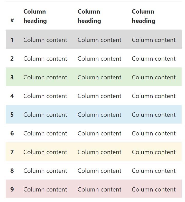
<!-- On rows -->
<tr class="table-active">...</tr>
<tr class="table-success">...</tr>
<tr class="table-warning">...</tr>
<tr class="table-danger">...</tr>
<tr class="table-info">...</tr>

<!-- On cells (`td` or `th`) -->
<tr>
  <td class="table-active">...</td>
  <td class="table-success">...</td>
  <td class="table-warning">...</td>
  <td class="table-danger">...</td>
  <td class="table-info">...</td>
</tr>
Changing the rows of a table Bootstrap 3 doesn't use the
.table-.active.table-active● active: Puts on the focus coloring to the table row or table cell
● success: Signifies a positive or successful action
● info: Indicates a neutral information change or action
● warning: Indicates a warning that you might need care
● danger: Displays a dangerous or potentially negative action
Responsive Tables
To create a responsive table - use the
.table-responsive
Bootstrap 4 allows you to add the
.table-responsiveCheck a few online video short training relating to Bootstrap 4 tables
Linked topics:
Bootstrap Table Responsive
__
W3schools:Bootstrap table tutorial
Bootstrap Tables Lecture